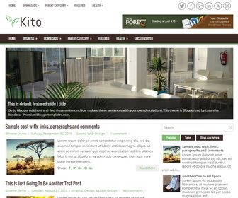
Kalem

The template details
Features & setup
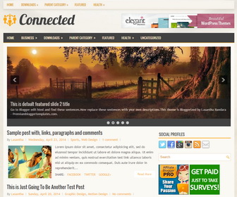
Kalem is a Fully Responsive, 2 Columns, General/Blog Blogger Template with a Right Sidebar and 3 Columns Footer. Kalem Blogger Template has a Mobile Friendly Slider, 2 Navigation Menus, 468x60 Header Banner, Related Posts, Breadcrumb, Social and Share Buttons, Web Fonts, Auto Read More, Tabbed Widget and More Features.
Template type : 1 Sidebar, 2 Columns, 3 Columns Footer, Adapted from WordPress, Brown, Breadcrumb, Elegant, Featured Section, Responsive, jQuery Included, Header Banner, HTML5, Magazine, Mobile Friendly, Premium, Related Posts with Thumbnails, Right Sidebar, Slider, Share Buttons, Social Buttons, Tabbed widget, Top Navigation Menu, White
How to Configure Kalem Blogger Template
Read instructions given below to configure Kalem Blogger Template.
Main column area width is 615px.
There are with slider and without slider versions in this theme.
How To Configure Navigation Menu
How To Configure Responsive Slider
Ready to install?
Back up your current Blogger template first, then follow this template’s own setup notes.
Installation guide → Ask a question →Find your next design
A template that fits your blog.
Choose your style, layout and features to explore the collection.
Keep exploring